Your signboard is often the very first interaction a potential customer has with your business. Before they step through your door, read your menu, or check your prices — they see your sign. And in those few seconds, they decide whether your business looks trustworthy, professional, and worth their time.
Yet we see it every day: businesses spending thousands on a signboard that is hard to read, poorly designed, or just plain forgettable. The truth is, research shows that 7 out of 10 consumers judge the quality of a business based on its signage. Your signboard is not just a label — it is your most powerful marketing tool.
After manufacturing signboards for hundreds of businesses across Malaysia, we have learned exactly what works and what does not. This guide shares everything we know about creating signboard designs that actually drive customers through your door.

Why Signboard Design Matters More Than You Think
Consider these facts about signage in Malaysia:
- 76% of consumers have entered a store they had never visited before based purely on its signage
- A well-designed signboard can increase business revenue by 7-10% on average
- Motorists travelling at 60 km/h have approximately 3-5 seconds to read your sign
- Pedestrians typically make a decision within 8 seconds of seeing a storefront
These numbers tell a clear story: your signboard design directly impacts your bottom line. Getting it right is not optional — it is essential.
Key Questions to Ask Before Designing Your Signboard
Before you jump into fonts and colours, answer these fundamental questions:
- Who is your target audience? A children's tuition centre needs a very different design from a law firm.
- What is the viewing distance? Is your sign facing a highway, a busy road, or a pedestrian walkway?
- What is the viewing angle? Will customers approach from the left, right, or straight on?
- Day or night visibility? Do you need illumination for evening customers?
- What is your surrounding environment? Look at neighbouring signboards — you need to stand out, not blend in.
UMAKE insight: We always visit the installation site before finalising any design. Photographs alone do not capture the full picture — lighting conditions, neighbouring signs, viewing angles, and even tree coverage can dramatically affect how your signboard performs in the real world.
Font Size: The Most Critical Design Decision
The number one mistake we see in signboard design is text that is too small. If people cannot read your sign, it does not matter how beautiful it looks.
Font Size Guidelines by Viewing Distance
| Viewing Distance | Minimum Letter Height | Typical Use |
|---|---|---|
| 3-5 metres | 2.5 - 5 cm | Door signs, window decals |
| 10-15 metres | 7.5 - 12 cm | Shopfront signboards |
| 20-30 metres | 15 - 25 cm | Road-facing business signs |
| 50-100 metres | 30 - 60 cm | Highway billboards, building signs |
Pro tip: Print your design at full scale on paper, tape it to a wall, and walk to the expected viewing distance. If you cannot read it clearly, increase the font size. This simple test has saved many of our clients from expensive reprints.
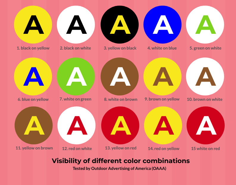
Colour Contrast: The Science of Readability
Even with the perfect font size, poor colour contrast will make your signboard unreadable. The key principle is simple: the greater the contrast between your text and background, the easier it is to read.
Most Readable Colour Combinations (Ranked)
| Rank | Text Colour | Background Colour | Readability Score |
|---|---|---|---|
| 1 | Black | Yellow | Excellent |
| 2 | Black | White | Excellent |
| 3 | White | Dark Blue | Very Good |
| 4 | White | Red | Very Good |
| 5 | White | Black | Good |
| 6 | Yellow | Black | Good |
Visual comparison of colour contrast — higher contrast = better readability from a distance.
Need help with signboard design?
Get a free quote from UMAKE — custom signage designed and manufactured in Malaysia.
UMAKE insight: White backgrounds are the most versatile choice because almost any text colour contrasts well against them. However, in Malaysia where many shoplot facades are already light-coloured, a dark background with white or yellow text often creates better standout. We always consider the building facade colour when recommending signboard colours — your sign needs to contrast with its surroundings, not just internally.
Colours to Avoid Together
- Red text on green background (or vice versa) — poor contrast, also problematic for colour-blind viewers
- Light grey on white — virtually invisible from any distance
- Dark blue on black — blends together, especially at night
- Yellow on white — extremely poor readability
Font Selection: Matching Your Brand Personality
Your font choice communicates as much about your business as the words themselves. Here is how to choose wisely:
Font Categories and Best Uses
| Font Type | Personality | Best For |
|---|---|---|
| Serif (e.g., Times New Roman) | Traditional, trustworthy, professional | Law firms, clinics, jewellery shops |
| Sans-Serif (e.g., Helvetica, Arial) | Modern, clean, approachable | Tech companies, retail, F&B chains |
| Script (e.g., handwritten styles) | Elegant, creative, personal | Salons, bakeries, boutiques |
| Bold/Slab (e.g., Impact) | Strong, attention-grabbing | Workshops, hardware stores, sports |
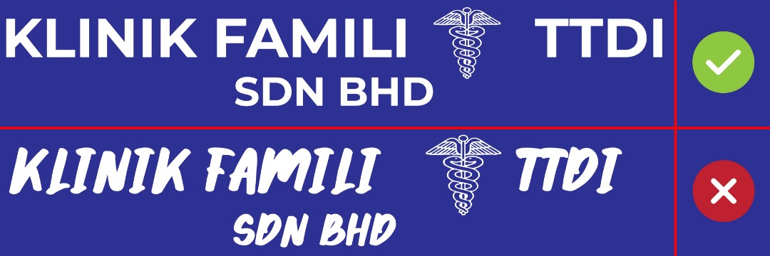
Important rule: Never use more than 2 fonts on a single signboard. One for your business name, one for supporting text. More than two creates visual chaos.
Avoid all-caps for long text. While ALL CAPS works for short business names, using it for phrases like "WE SELL ALL KINDS OF HARDWARE AND ELECTRICAL PRODUCTS" reduces readability by up to 30%. Mixed case is always easier to read for longer text.
The Golden Rule: Less Is More
This is the single most important design principle for signboards, and the one most business owners struggle with.
Your signboard is NOT a product catalogue. It is not the place to list every service you offer, every product you sell, or every promotion you are running. Here is why:
- A motorist at 60 km/h has 3-5 seconds to read your sign
- A pedestrian gives you 5-8 seconds at most
- The human brain processes 7 words in a quick glance
This means your signboard should communicate three things maximum:
- Your business name
- What you do (one line)
- Your phone number or website (optional)
UMAKE insight: We have a saying in our workshop: "If you cannot read it from across the street in 3 seconds, redesign it." Some of the most effective signboards we have produced contain nothing but the business name in large, bold letters. Think about the most recognizable brands — McDonald's, Petronas, Public Bank — their signs are simple, bold, and instantly recognizable. You should aim for the same principle.
DBP Compliance in Your Design
Every signboard in Malaysia must comply with Dewan Bahasa dan Pustaka (DBP) language requirements. Failing to incorporate these into your design from the start will result in rejection and costly redesigns.
Key requirements:
- Bahasa Malaysia text must be at least 30% larger than other languages
- Business nature in Bahasa Malaysia must be visible and prominent
- Correct spelling and grammar are mandatory
- The Malay text should be placed in a prominent position (typically top or left)
For detailed information on the licensing process, read our comprehensive guide: Signboard License Malaysia: Complete Guide.
Signboard Design Checklist
Before you finalise your design, run through this checklist:
- Can your business name be read from the maximum expected viewing distance?
- Is the colour contrast high enough for both day and night visibility?
- Are you using no more than 2 fonts?
- Is the content limited to essential information only?
- Does the Bahasa Malaysia text meet the 30% size requirement?
- Does the design match your brand personality?
- Have you tested a full-scale mockup at the actual location?
- Does the design stand out from neighbouring signboards?
- Is your contact information (phone/website) readable?
- Does the design work with the building facade colour?
Frequently Asked Questions (FAQ)
How much does it cost to design a signboard in Malaysia?
Design costs vary widely. A basic design from a signboard company may be included in the manufacturing cost (RM0 extra). Professional graphic design services typically charge RM200-RM1,000 depending on complexity. At UMAKE, we include design consultation as part of our signboard packages — you only pay for manufacturing and installation.
What is the best material for signboard in Malaysia?
The most popular materials are aluminium composite panel (ACP) for flat signboards, acrylic for 3D letters and lightboxes, and stainless steel for premium corporate signage. Each has different durability, cost, and aesthetic properties. Our guide on 3D Letter vs Flat Signs covers this in detail.
Should I use a lightbox or 3D letters for my signboard?
It depends on your budget and visibility needs. Lightboxes are more affordable (RM500-RM3,000) and provide even illumination. 3D letters look more premium (RM1,500-RM10,000+) and create a high-end impression. For businesses operating at night, illuminated options are essential.
Can I design my own signboard?
You can, but we strongly recommend working with a professional. DIY designs often fail DBP approval due to incorrect text sizing, use poor colour combinations that reduce readability, or do not account for the signboard material and installation constraints. A professional signboard company considers all these factors.
How long does it take to make a signboard in Malaysia?
From design approval to installation, typical timelines are: simple lightbox signboards (5-7 working days), 3D letter signboards (7-14 working days), large format or custom signboards (14-30 working days). Add 3-8 weeks for the DBP and council licensing process.
What size should my signboard be?
This depends on your shopfront width and the viewing distance. A general rule: your signboard should be at least 60-80% of your shop facade width. For height, most shoplot signboards are 2-4 feet tall. We always recommend a site visit to determine the optimal size for maximum visibility.
Do I need a signboard license for my design?
Yes. All commercial signboards in Malaysia require both DBP design approval and a local council license. Read our complete guide on signboard licensing in Malaysia for the full step-by-step process.
Related Signboard Design Guides
Want to dive deeper into specific signboard topics? Check out these detailed guides:
- Lightbox Signboard Malaysia: Complete Guide — The most popular signboard type explained
- LED Signboard Malaysia: Complete Guide — Everything about LED signage technology
- Signboard Materials Malaysia: Comparison Guide — ACP, acrylic, stainless steel and more
- Restaurant Signboard Design Malaysia — Specific tips for F&B businesses
- Signboard Price Malaysia: Complete Cost Guide — Budget planning for your signboard
- Signboard License Malaysia: Complete Guide — How to get your signboard legally approved
- 3D Letter Signboard vs Flat Signs — Which type is right for your business?
Conclusion
A great signboard design is not about being the most colourful or the most elaborate — it is about being the most effective. Focus on readability, simplicity, and brand alignment. Remember: your sign has just a few seconds to make an impression. Make those seconds count.
At UMAKE, we combine design expertise with manufacturing capability to deliver signboards that do not just look good — they perform. From initial concept to DBP approval to final installation, we handle everything.
Need a signboard that works? Get a free design consultation from UMAKE — let us help you create a sign that drives real business results.